EnterpriseAlumni: User Settings
A review of a feature I built as Lead Engineer at EnterpriseAlumni
March 14, 2023

EnterpriseAlumni
EnterpriseAlumni is a platform for corporations to connect with their alumni network. Think LinkedIn for a company's previous employees. Alumni users can view news, find networking opportunities, and attend events. Companies can recruit boomerang hires, sell goods, and build their brand.
I was Lead Software Engineer at EnterpriseAlumni, promoted from Senior Frontend Engineer after 2 years. My role was to lead a cross-functional engineering team of 7 to deliver major new features, and to manage and mentor the frontend team of 4. I collaborated with design and product to define requirements and iterate on UI/UX improvements. I managed projects as tech lead, planned implementation strategies, and developed responsive applications. For more about my achievements here, please see my resume.
The main user platform, AlumniPortal, was built with a complex legacy combination of AngularJS and Angular. In Q2-Q3 of 2022, we undertook a significant overhaul and redesign of the product, also introducing new features of notifications and user-to-user chat. One of the largest pieces of this redesign was User Settings.
User Settings
User Settings was a challenge to reimagine the existing UX and implement on top of legacy code. It was very rewarding to simplify a cumbersome and unappealing experience to make it more enjoyable to use.
Goals
- Improve the UX of the existing settings page, especially on mobile.
- Make it easier and more engaging to navigate settings and edit information.
Design
I met with design and product teams each week to discuss iterations of the project and provide suggestions. I had significant input into the overall designs, as it was a full-team collaborative effort, and I communicated the technical challenges and tradeoffs involved in implementing the designs.
The existing User Settings form was large and lacked any visual hierarchy, making it difficult to understand and see where action should be taken. Additionally, the lone Save button at the bottom was a hassle to scroll down to, increasing the friction between the user and their desired action.

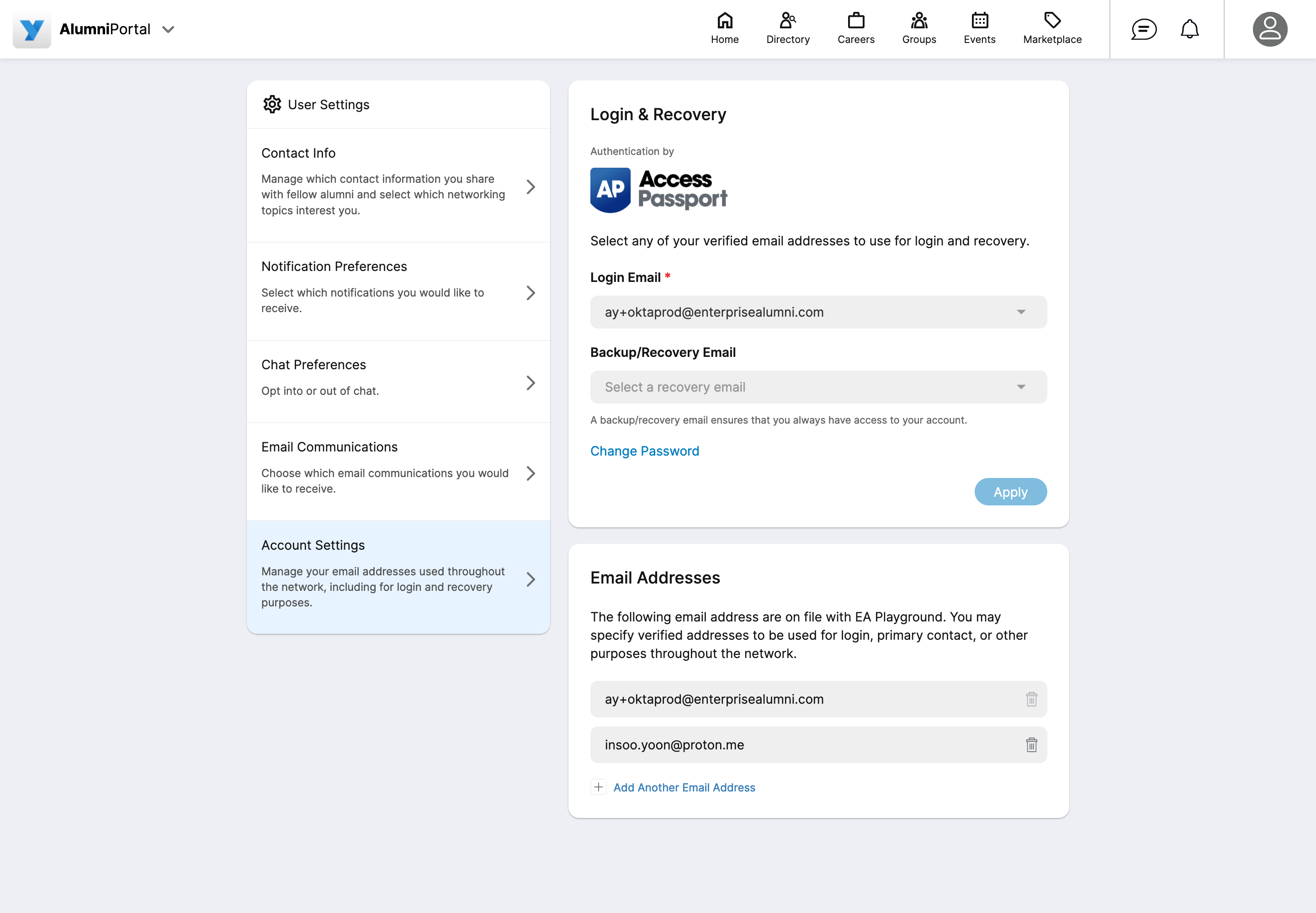
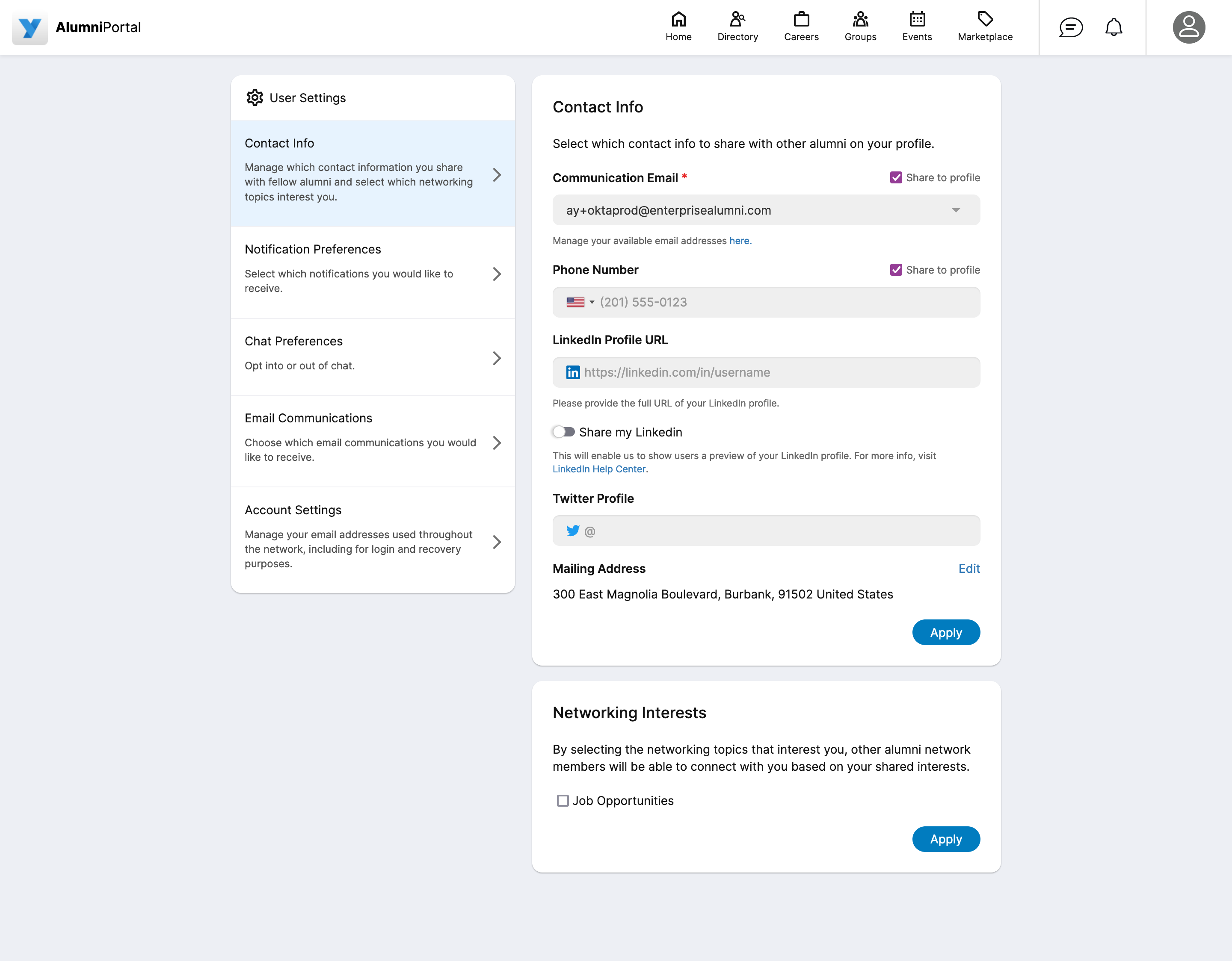
I suggested splitting the form into separate tabs to simplify the editing experience. These tabs would navigate into separate subpages on the mobile app, which was not within the design language at the time. This is a very common pattern in modern apps, so users would find it intuitive and familiar.


Using this modern navigation pattern, the settings could be edited in easily digestible chunks, reducing the cognitive load on the user. Instead of having one long and complex form, users could now see at a glance which categories they wanted to change, tap there and see a much more manageable subset of fields.

Development
Working on a tight deadline and wrestling with extreme technical debt in the codebase, I made several quick decisions on tradeoffs to ensure we kept our velocity on-track for delivery.
After prototyping a few different implementation approaches, I decided to build a new page from scratch, to circumvent as many of the problems as possible in our legacy code. With this approach I had much more freedom to write the code with very clear structure and comments, instead of reusing over-complicated components.
Frontend State Management
The application used Redux to hold the current user's data, which is usually a powerful solution to manage application state. In this case, it was needlessly complex. The state was only read and modified in top-level components, and all data, whether used or not, was passed down the component hierarchy, often through 6+ layers of nesting.
To solve this, I simplified Redux usage to align with best practices. I read the global store within each component only when necessary, eliminating the need to pass through dozens of properties. I also optimized the logic to update the state, calling specific reducers rather than writing the entire state on any update. This improved the application performance and memory footprint, and greatly simplified the code for future development.
Waterfall API Calls
The existing API structure presented another performance challenge, as it required dozens of calls in a waterfall fashion—first get user's basic data, then get their full profile, then get their email addresses, etc. In an ideal world, I would redesign those APIs, as it would be simpler and faster to aggregate that data on the backend then receive it in one call on the browser. There was also potential to redesign the data layer to store that data more efficiently (using NoSQL for example).
With the pressing deadline, however, modifying the API and backend were out of scope, so I short-circuited as much of the data fetching as possible, only calling the specific API's that were needed on each page and saving dozens of network requests. This was another advantage of splitting the forms into separate tabs, as more data could be lazy loaded.
The Results & What I Learned
I delivered the User Settings feature on time with improved performance. Taking ownership of this feature, I fixed any bugs that came up after initial delivery and educated other developers on how the underlying systems worked. I learned more about Redux and RxJS and how to use it simply and effectively, as well as clear examples how not to use it.
I suggested and prototyped hierarchy improvements in the UI and saw how markedly it upgraded the UX. I showed my intuition for product based on experience and am proud of the achievement, yet it would be great to have metrics and specific measurable improvements.
If I could redo the project, I would first test performance on the initial product and after the redesign, as well as compare bundle size. It was immediately clear that the feel and experience was greatly upgraded, which inspired our largest clients to enable the feature for their user bases of over 30,000 users. However, it was not clear exactly how this contributed to improve KPI's such as user retention rate and MAU's. Instituting user feedback and customer surveys would also add useful qualitative data for us to make better choices for the next iteration.
At the current stage in my career, I am focusing much more on code robustness and measuring data to make wiser, evidence-based decisions. Taking measurements was one weakness at the company, and I pushed for this several times, though I wish I had prototyped and presented my ideas in this area even more, using metrics to show tangible value improvements.
Overall, I am pleased with the results of the User Settings feature. In an under-resourced team on a very aggressive timeline, I made the necessary decisions to ensure the timely delivery of a well-functioning and polished product.